
A Brief Branding Guide For Startups In 2025
A branding guide, or a style guide, or a brand style guide, is a document containing detailed and specific instructions on how to present your brand to the world and protect it. It contains your brand’s entire visual environment with clear rules about the nitty gritty of presentation.
Depending on the particular startup and the scope of its brand, a style guide can be brief or many pages long. Whichever it is, it must cover your brand’s basics so whenever your audience sees you or speaks to you, a cohesive and consistent brand experience can be created for them.
In this article, we will briefly go over the essentials of a branding guide and give you examples of brands that have nailed it.
We will also talk about how to adapt your startup branding rules for a changed world in 2025. Because of the climate and culture, we’re currently in, and the education brands are going through, it’s incredibly important to have your values come across through your branding. Tell people what you stand for, and let them see that commitment through your visuals as well as your tone.
Come. Let’s begin.

Why Are Branding Guides Important For Startups?
Branding guides serve three important functions for startups.
- A definitive reference point
No matter if your startup team is scattered all over the country or even the globe, a branding guide will serve as a blueprint or a singular reference point that all teams can look to when presenting your brand to the world.
With clear brand guidelines, everyone will be able to communicate the exact content, design, and tone that is intended by the brand. This reduces chances of marketing or design faux pass, and ensures your brand is presented seamlessly across all media.
- Consistent messaging
Consistency is key in branding. When you have a style guide, you have a document that lists all the rules and guidelines on how to keep the brand message consistent. This applies to design, tone, and vocabulary, too.
- Unified brand identity
A unified or consistent brand identity is vital whether you are a startup or a large organization. But for startups, its importance multiplies. It enables your audience to recognize your brand quickly and solidifies that recognition in their memory. In comparison to having a haphazard identity, a strong and consistent one makes your brand more memorable and recognizable.
Essentials Of A Brand Guide
We’ve already mentioned that your brand guide could be as brief or as expansive as you want, but in the initial stages of your startup brand development, keep the guide concise. Only add things that are relevant for the next year or two so you don’t confuse yourself about things that could happen way into the future.
Later, as your brand begins to grow, so could (and must) your branding guide and all that it contains within.
1. Mission Statement
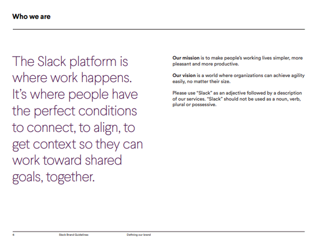
Image: Slack Brand Guidelines
Start your branding guide by clearly spelling out your mission statement, values, and vision.
Take people on board and tell them the story behind your brand. When you share your mission and vision statement and describe your values, it helps everyone understand why the brand needs to be the way it is and equips them to take ownership of the brand and present it to the world authentically.
2. Brand Logo
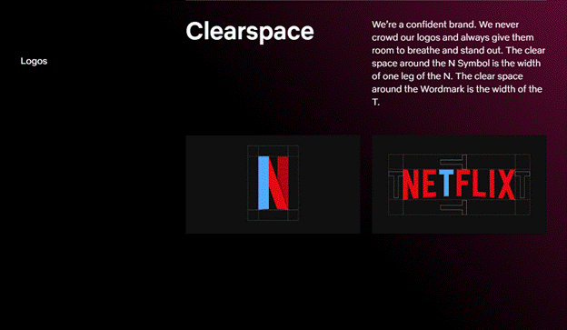
Image: Netflix Brand Microsite
Describe the design considerations behind your logo and specify the usage rules. Talk about size, color, font, placement, and layout. Do you have a tagline? Outline where it can be used and where it cannot.
Also mention and give visual examples of your logo variants. Make multiple variants of your good logo design to suit different needs, backgrounds, and mediums. Your print logo, for example, on company envelopes can be different from your letter mark logo on social media.
Ideally, make a good brand logo in 3-4 different variants. Apart from the main logo, the secondary versions could include all-icons, all-words, and letter abbreviations. Specify the uses of each variant and rule out situations in which a certain variant cannot be used.
Outline the font and color rules for your logo design, too. Remember, your logo is the most visual and vital asset of your brand. The clearer and more detailed you are with its usage instructions, the more protection you lend to your brand.
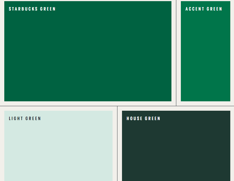
3. Color Palette
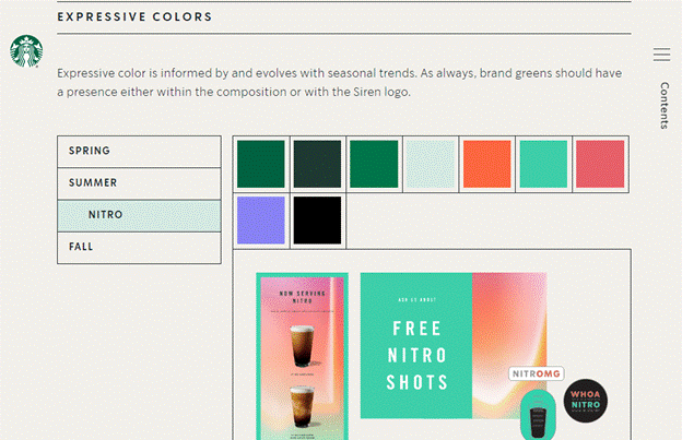
Image from Starbucks Brand Guide
People pay close attention to colors, and most of it happens on a subconscious level. We attach meanings and emotions to colors based on our personal preferences, moods, emotions, culture, and background.
With colors being such loaded vessels of communication, it’s important to get them always right when you have to replicate them. This replication will happen whenever you have to create new images/charts/presentations etc., for website content, email newsletters, and more.
If you use certain colors on seasonal (or other bases), like Starbucks, specify those palettes, too. And to keep everything clear, make sure you add as many examples and actual color imagery as you can.
To leave no room for error, specify color codes for each color in your palette. These codes include HEX, RGB, and CMYK. Include Pantone codes, too.
Also, remember to use different colors and color combinations for your logo and other brand assets. So, in your guidelines, separate these two and specify color palettes, codes, and combinations for your logo design as well as the larger brand.
Also read:
- Tips for Defining Your Brand Without a Large Budget
- Why Shopify Entrepreneurs Need to Focus on Brand Protection
- 5 Branding Strategies Every Startup Founder Should Know About
4. Typography System
Your brand style guide needs to have an entire section dedicated to typography and its usage.
As with color palettes, choose different fonts for your logo and other brand assets. This is necessary so the logo can stand out among your CTAs and other icons.
Start by introducing your type family. Choose one and find your variants among them. Walmart, for example, has created a custom typeface Bogle and uses its variants as its secondary fonts for usage and combinations.
Sticking with one typeface family allows the text-based visuals to keep with a certain rhythm and look. It’ll further add to consistency and a harmonious brand will appear as a result.
When you are describing rules to your brand typography, include things like font sizes, kerning, alignment, line spacing, and more.
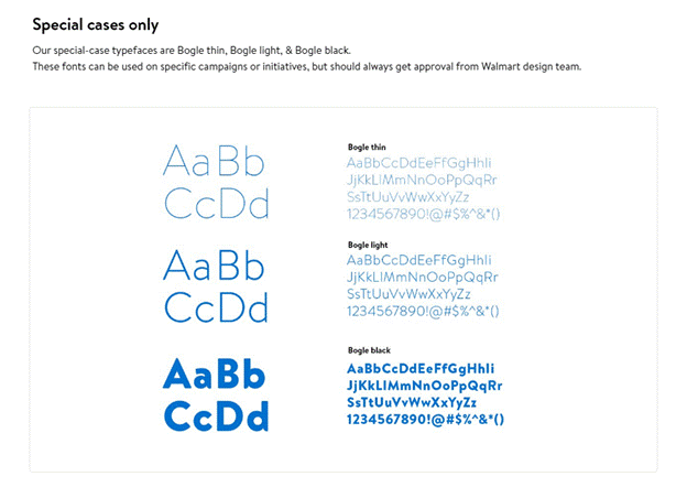
Image: Walmart Brand Guidelines
If you want to keep certain font combinations for main usage while others for secondary purposes, lay it out in the style guide. Add content examples for headers, sub-headers, social media content, quotes, citations, and more. Describe your rules for typography hierarchy, and give examples for clarity.
Remember, if you have certain ideas in mind regarding how you want your type to appear on paper/screen, spell it out. Clear examples will reduce the chances of honest mistakes and will keep everyone on the same page.
5. Photography & Imagery
The way you capture your brand, the imagery, and the compositions you use are unique to you. Since human beings are visual creatures, we pay a lot of stock into visuals guiding most of our decisions, even when we don’t want to.
To make sure you use this tendency to help solidify your brand’s aesthetics in your audience’s mind, you have to help your team understand your vision and carry it through in all the product and other photography for your brand.
This includes rules and instructions about product photography templates, what kind of product pictures are allowed, how to insert text overlays, and whether they are allowed in the first place or not. If you want to specify one set of fonts solely for your photography and imagery, you need to add that in your style guide too.
An important thing to add here, avoid using stock images as much as possible. While they do work as good placeholders in certain situations, don’t normalize their use for your brand as it cheapens the entire look. Aim for original branding to elevate your brand among your peers and communicate an authentic narrative for your brand.
6. Brand Voice
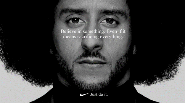
Image: FutureVision
How your brand sounds to people is as important as how it looks. Think of Nike versus Wendy’s. Both are iconic brands in their domains, but with very different voices and tones. Whenever you see a Nike ad, the message is inspirational, positive, and talks about goals and achievements. Wendy’s is witty and fun. When she speaks, you get the impression of a cool, casual, and fun person that you’d love to hang out with.
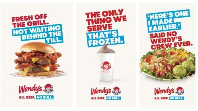
Image: Ad Week
As a brand, it’s your call how you envision your brand voice. But once you arrive at it and develop it, make it a part of your style guide so everyone is onboard.
To make sure marketers, designers, customer service, and other teams get your tone and voice right, use your branding guide to lay down its rules. Brands like Skype add preferred phrases, words, and adjectives to describe the brand voice and give examples of how the brand should and should not sound.
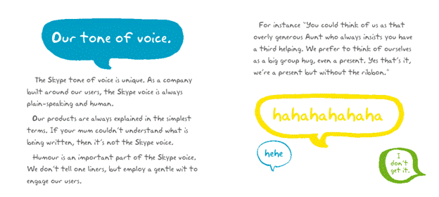
Image: Skype Style Guide
Conclusion
When developing your startup brand, the design and identity decisions rest with you. Once you solidify them into a style guide, they become your brand’s sole reference point. You could change them from time to time but before you put anything to writing, make sure this is the exact and the most perfect way your brand can be represented.
Then you can let your brand book out into the open and let others understand where your brand is coming from. Once people get behind your message and see how you want it communicated, it makes them more likely to rally behind your cause and, ultimately, become brand loyalists.